
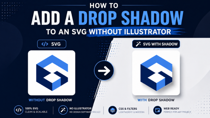
Drop shadows make SVG elements feel grounded, dimensional, and visually polished. They are a small detail that separates a flat, generic-looking icon from something that feels professionally finished. The problem most people run into is assuming you need Adobe Illustrator to add one. You do not.
SVG has a built-in filter system that handles drop shadows natively. You can also add them with pure CSS. Both approaches work directly in the browser, cost nothing, and give you more control than most design tools provide. This article covers how to add drop shadows to SVG files using three different methods, what each is good for, and how to customize the effect precisely.
Method 1: SVG Filter Primitives (feDropShadow)
The most native and flexible way to add a drop shadow to an SVG is using SVG filter primitives directly in the markup. Modern browsers support this natively with no libraries or plugins required.
The Basic Setup
SVG filters are defined inside a <defs> block and then applied to elements using the filter attribute. Here is the simplest possible drop shadow:
<svg xmlns=”http://www.w3.org/2000/svg” width=”200″ height=”200″ viewBox=”0 0 200 200″>
<defs>
<filter id=”drop-shadow”>
<feDropShadow dx=”4″ dy=”4″ stdDeviation=”3″ flood-color=”#000000″ flood-opacity=”0.3″/>
</filter>
</defs>
<rect x=”40″ y=”40″ width=”120″ height=”120″ fill=”#4A90D9″ filter=”url(#drop-shadow)”/>
</svg>
Breaking Down the Attributes
dx controls how far the shadow is offset horizontally. Positive values move the shadow right. Negative values move it left.
dy controls the vertical offset. Positive moves the shadow down. Negative moves it up.
stdDeviation controls the blur radius of the shadow. A value of 0 creates a hard, sharp shadow. Higher values create a softer, more diffused shadow. Values between 2 and 6 cover most practical use cases.
flood-color sets the shadow color. You can use any CSS color value here, including hex codes, RGB, or named colors.
flood-opacity controls the shadow transparency. A value of 1 is fully opaque, 0 is fully transparent. Shadows typically look more natural between 0.2 and 0.5.
Controlling Shadow Spread
The basic feDropShadow does not have a spread parameter like CSS box-shadow does. If you need a larger, more expanded shadow, use the longer-form filter chain:
<filter id=”expanded-shadow” x=”-20%” y=”-20%” width=”140%” height=”140%”>
<feGaussianBlur in=”SourceAlpha” stdDeviation=”5″ result=”blur”/>
<feOffset dx=”4″ dy=”6″ result=”offset”/>
<feFlood flood-color=”#000000″ flood-opacity=”0.25″ result=”color”/>
<feComposite in=”color” in2=”offset” operator=”in” result=”shadow”/>
<feMerge>
<feMergeNode in=”shadow”/>
<feMergeNode in=”SourceGraphic”/>
</feMerge>
</filter>
This more explicit version gives you independent control over the blur, offset, and color, and the feMerge at the end ensures the original shape renders on top of its shadow.
The Filter Region
Notice the x=”-20%” y=”-20%” width=”140%” height=”140%” on the filter element. This is the filter region. By default, SVG filter regions are fairly small and the shadow may get clipped at the edges. Expanding the filter region ensures the shadow has room to render fully, especially for large offset or blur values.
Method 2: CSS Filter (drop-shadow)
CSS offers a drop-shadow() function that works on SVG elements and is significantly faster to apply when you are styling multiple elements at once.
Inline on a Single Element
<svg xmlns=”http://www.w3.org/2000/svg” width=”200″ height=”200″ viewBox=”0 0 200 200″>
<rect x=”40″ y=”40″ width=”120″ height=”120″ fill=”#4A90D9″
style=”filter: drop-shadow(4px 4px 6px rgba(0,0,0,0.3))”/>
</svg>
Via CSS Stylesheet
If you are using inline SVG in HTML, you can apply shadows from your stylesheet, which keeps your SVG markup cleaner:
.icon-with-shadow {
filter: drop-shadow(3px 5px 5px rgba(0, 0, 0, 0.25));
}
<svg class=”icon-with-shadow” xmlns=”http://www.w3.org/2000/svg” viewBox=”0 0 100 100″>
<!– SVG content here –>
</svg>
CSS drop-shadow vs. box-shadow
This is a distinction worth knowing. box-shadow applies to the rectangular bounding box of an HTML element. drop-shadow() in CSS filter follows the actual shape of the SVG content, including transparency. This means if you have a star-shaped SVG, the shadow follows the star’s contour, not a rectangle around it. That is the behavior you almost always want for SVGs.
Limitation of CSS drop-shadow
CSS drop-shadow does not work when the SVG is loaded as an <img> tag or as a CSS background-image. It only works on inline SVG or on elements styled directly in the document. For background images and <img> tags, use the SVG filter primitive method instead, baking the shadow into the SVG source file directly.
Method 3: Adding Drop Shadows Without Code Using SVGMaker
If you want to apply a drop shadow visually without touching the SVG code, SVGMaker’s editor gives you a point-and-click approach. This is useful when you are working with an SVG you received from a client or downloaded from a library and do not want to manually parse through the markup to add a filter.
Inside the editor, select the element you want to shadow, open the style panel, and adjust the shadow settings. The tool generates the correct SVG filter code for you and embeds it cleanly in the file. When you export, the shadow is baked into the SVG source, so it works everywhere including in <img> tags and email clients that do not support CSS filters.
This approach is particularly helpful when working with complex, multi-layered SVGs where applying a shadow to nested groups manually would require careful filter inheritance management.
Practical Shadow Styles and When to Use Them
Not every shadow looks the same, and the right style depends on your design intent.
Subtle ambient shadow for depth without drama. Use low opacity, small offset, and moderate blur. Good for UI icons, card illustrations, and product graphics.
dx=”2″ dy=”2″ stdDeviation=”4″ flood-opacity=”0.15″
Hard shadow for a bold, graphic look. Use zero or very low blur with a clear offset. Works well for retro designs and strong geometric shapes.
dx=”5″ dy=”5″ stdDeviation=”0″ flood-opacity=”0.5″
Long shadow for a modern flat-design effect. Use a large horizontal and vertical offset with no blur. Common in icon design.
dx=”10″ dy=”10″ stdDeviation=”0″ flood-opacity=”0.2″
Colored shadow for brand-aligned effects. Use a shadow color that complements the shape rather than defaulting to black. Works well for illustrations and brand graphics.
flood-color=”#1a1a7e” flood-opacity=”0.3″
Troubleshooting Common Drop Shadow Issues
Shadow is getting clipped: Expand the filter region by setting larger percentage values on the x, y, width, and height attributes of your <filter> element.
Shadow is applying to the whole SVG, not just one element: If you apply the filter to the root <svg> element, it affects everything inside it including the background. Apply the filter attribute to specific child elements instead.
Shadow appears behind the wrong element: When using the long-form filter chain, confirm that your feMerge block has SourceGraphic as the last node so the original shape renders on top of its shadow.
CSS shadow is not showing in email clients: Email clients have very inconsistent CSS support. For email-safe SVGs, use the SVG filter primitive method and bake the shadow into the file.
Shadow looks different across browsers: This is usually a stdDeviation rounding difference. Use whole numbers for stdDeviation to get the most consistent rendering.
Adding Drop Shadows to SVGs in React
If you are working in a React application with inline SVGs, the CSS filter approach integrates cleanly:
const ShadowedIcon = () => (
<svg
xmlns=”http://www.w3.org/2000/svg”
width=”100″
height=”100″
viewBox=”0 0 100 100″
style={{ filter: ‘drop-shadow(3px 4px 5px rgba(0,0,0,0.2))’ }}
>
<circle cx=”50″ cy=”50″ r=”40″ fill=”#FF6B6B” />
</svg>
);
For SVG filter primitives in React, use camelCase for the filter attributes since JSX requires it. For example, flood-color becomes floodColor and flood-opacity becomes floodOpacity.
Conclusion
Adding a drop shadow to an SVG is well within reach without any paid software. SVG filter primitives give you the most control and the most compatibility. CSS filters are fast to apply when styling inline SVGs in a web project. And for a no-code approach, SVGMaker handles the filter generation visually so you can focus on the design rather than the markup.
The key thing to remember is that the right method depends on how you are embedding the SVG. Understand your embed context, pick the method that matches, and your shadow will render exactly as intended.
